TNT estd. 1990
Local time:
/Paddling Life
/2025/

Client
Paddling Life
Timeline
4 weeks
Date

Logo, Ever Green Design
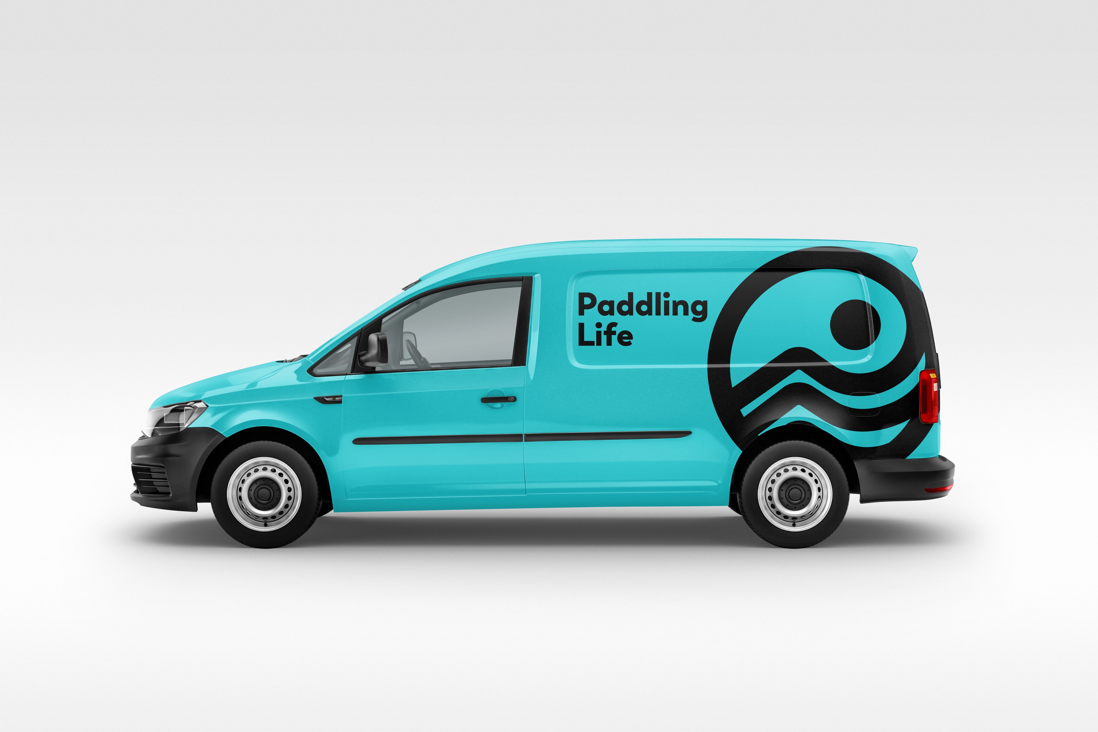
A logo that could speak to every paddler, from raft and whitewater to SUP and sea kayak, without picking a side.


The work
Keep the stoke alive for all of paddling, not one craft.
Keep the stoke alive for all of paddling, not one craft.
The problem
The problem
Paddling Life exists to grow the sport and keep the stoke alive. After sitting with their team, that mission was clearly the brief. They needed a logo versatile enough for rafters, whitewater kayakers, standup paddleboarders, and sea kayakers. Pick one tribe and you lose the rest.
Paddling Life exists to grow the sport and keep the stoke alive. After sitting with their team, that mission was clearly the brief. They needed a logo versatile enough for rafters, whitewater kayakers, standup paddleboarders, and sea kayakers. Pick one tribe and you lose the rest.
Paddling Life exists to grow the sport and keep the stoke alive. After sitting with their team, that mission was clearly the brief. They needed a logo versatile enough for rafters, whitewater kayakers, standup paddleboarders, and sea kayakers. Pick one tribe and you lose the rest.
Why it mattered
Why it mattered
The community is the product. If the logo picks a side, the organization starts looking smaller than it is. The mark has to leave room for all of them.
The community is the product. If the logo picks a side, the organization starts looking smaller than it is. The mark has to leave room for all of them.
The community is the product. If the logo picks a side, the organization starts looking smaller than it is. The mark has to leave room for all of them.
What I did
What I did
I designed for the shared thing, which is being on the water, not for a single hull. The mark had to welcome the whole paddling family instead of advertising one craft.
I designed for the shared thing, which is being on the water, not for a single hull. The mark had to welcome the whole paddling family instead of advertising one craft.
I designed for the shared thing, which is being on the water, not for a single hull. The mark had to welcome the whole paddling family instead of advertising one craft.
What we stopped
What we stopped
I stopped exploring marks that only read as a kayak brand or only read as a SUP brand. Those versions were clear, and they were also exclusive in a way the mission could not afford.
I stopped exploring marks that only read as a kayak brand or only read as a SUP brand. Those versions were clear, and they were also exclusive in a way the mission could not afford.
I stopped exploring marks that only read as a kayak brand or only read as a SUP brand. Those versions were clear, and they were also exclusive in a way the mission could not afford.
What shipped
What shipped
They got a versatile identity they could take into the paddlesports community without leaving someone off the boat. It was meant to work in the same places the community already gathers.
They got a versatile identity they could take into the paddlesports community without leaving someone off the boat. It was meant to work in the same places the community already gathers.
They got a versatile identity they could take into the paddlesports community without leaving someone off the boat. It was meant to work in the same places the community already gathers.


What changed
One logo for the whole paddling family.
One logo for the whole paddling family.
Works across raft, whitewater, SUP, and sea. The mission is visible in the mark, not only on the about page.
Branding
Design
/More projects
Year
Project name
Description